Praktijkpioniers Logo
Praktijkpioniers – Logo Development for a Creative Initiative
I developed a logo for Praktijkpioniers, a new initiative launched by the mother organization Nieuwland Werk Taal Zorg. Praktijkpioniers represents the creative and innovative branch of the organization, aimed at clients seeking fresh, original ideas. Guided by the motto “Trying never hurts,” the initiative focuses on development, growth, and pioneering new approaches.
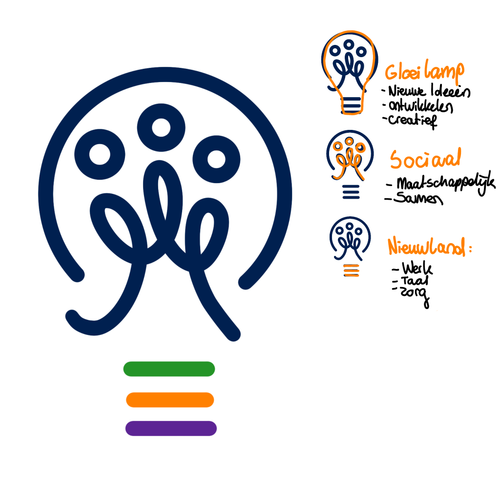
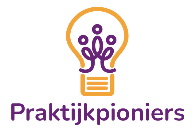
The logo I designed features three people inside a lightbulb, with three horizontal lines underneath. The lightbulb symbolizes ideas, development, and creativity. The connected figures at its core represent collaboration, social engagement, and meaningful contribution to society. The three lines underneath refer to Nieuwland’s core pillars: work, language, and care.
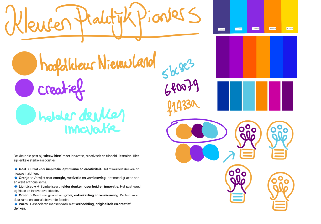
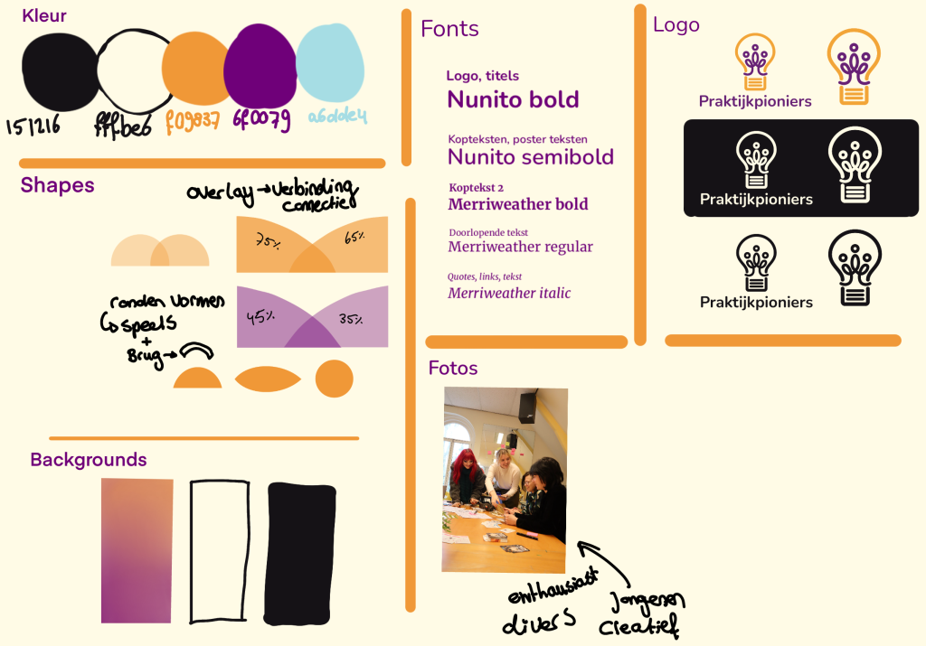
In terms of color, I chose orange and purple. Orange communicates energy, motivation, and innovation—it also connects to the broader Nieuwland brand and its affiliate, WelZoWijs. Purple was selected for its association with creativity and originality. For the broader visual identity, I introduced an additional color: blue, symbolizing clear thinking and innovation.
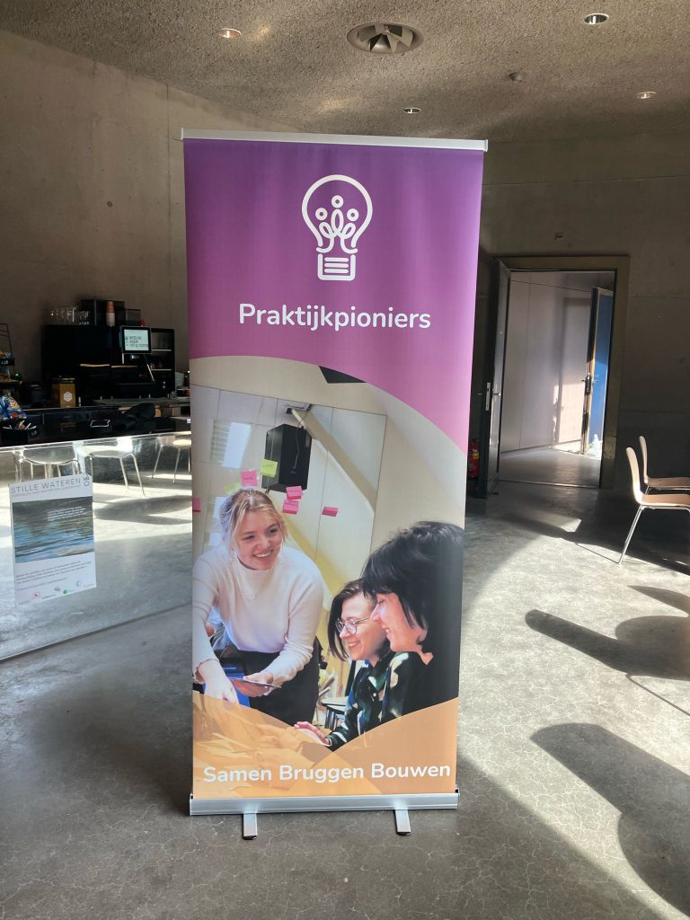
I used the font Nunito Bold for its playful and approachable appearance. For the visual style, I created soft, rounded shapes and overlays with transparency, echoing one of Praktijkpioniers’ key quotes: “Building bridges together.” These visual elements emphasize connection, collaboration, and strengthening each other—represented by semi-circles that resemble forming bridges.
