Nieuwland Werk Taal Zorg Logo
Nieuwland – Logo Design for Growth and Clarity
Nieuwland Werk Taal en Zorg supports people through work, language, and care—empowering them to grow and participate fully in society. I was asked to design a new logo that reflects professionalism, clarity, and growth—three essential values of the organization.
The concept “Nieuw Land – Without Limits” stands for personal development, learning, and stepping into new opportunities. It reflects Nieuwland’s active and practical mindset, helping people move forward with confidence and purpose. Many of their programs support people from international backgrounds or those stepping outside their comfort zones to take new steps in society. The logo needed to express development, trust and action
The final logo is clean, simple, and professional, avoiding unnecessary decoration. It consists of three straight horizontal lines, each representing one of Nieuwland’s core pillars: work, language, and care. The middle line is slightly extended to symbolize growth—a central focus of the organization’s mission.
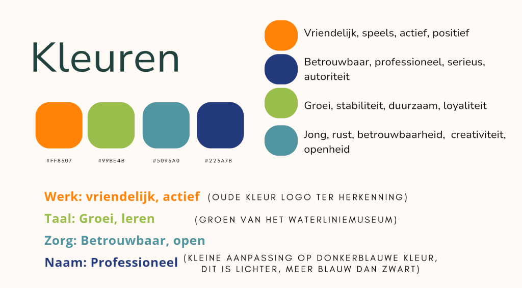
Color choices were made with meaning and consistency:
- Orange – represents work, activity, and energy. It is also Nieuwland’s original brand color and used across related initiatives like Welzowijs and Praktijkpioniers
- Green – stands for language and personal growth through learning. It also reflects values of stability and development
- Light Blue – symbolizes care, calmness, openness, and trust
- Dark Blue (used for the name) – adds a sense of reliability and continuity, referencing the old Nieuwland logo for brand recognition
Contact
Ilse.kors@gmail.com
Amersfoort